Emoria Character Icons
+17
Eternity
Fluesopp
quakernuts
Spectre
Shadow Moonseye
Blackrock
Guilty Carrion
Weiss
Dax
Hello Danger
Kathryn Lacey
Loki
ImmortalSin
Bird of Hermes
Gadreille
Sighlent
Kalon Ordona II
21 posters
Page 2 of 7
Page 2 of 7 •  1, 2, 3, 4, 5, 6, 7
 Re: Emoria Character Icons
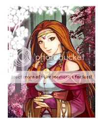
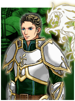
First, I want to say that from the opinion of an amateur photographer, there is way too much space above the heads of the portraits. In photography, it's always better to have more of the subject and less of the negative space. It's more aesthetically pleasing that way. I would say use more than just the bust, crop it to be smaller, add some text above the bust, or enlarge the bust to fill more of the portrait space.
I want to say that I also hate gold. I do much better with silver or white gold. Yellow gold is highly unappealing to me.
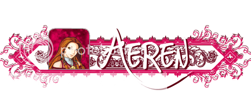
So far, my favorites have been Sighlent's creations for Silvone's character and for Aeren.
Of course, my problem with Aeren's is that the end is cut off by the forum itself on my browser. Not everyone has a wide-screen monitor. Mine is a humble little square.
I really like the spotty backgrounds for the portraits. They remind me of grade school pictures, but in a good way. My only problem with the colours is that they match the clothing of the subject too closely. The clothing gets lost against the background, and Kalon worked so hard on the portraits that the details should stand out better.
I think part of why Silvone's is my absolute favorite is that the image is completely clear without any fuzziness because it's in its normal size. If there was a way to have the country from which that character comes below the name in smaller font, it would be really cool.
I know my portrait hasn't been created yet, but I would like my character's first and last names as well as her location. Instead of Taurë Arda, it would be Nolwë Osto because that's its own city/state. =3
The colours will be determined by what Kalon produces for my portrait.
Kathryn Lacey- ★ Administrator ★

- Join date : 2009-05-28

Posts : 6968
 Re: Emoria Character Icons
Ok so if you guys want me to do everyone's random then I'm going to need to know if you want their first and last name or just their first name because I just finished mine if I do this way and mine only has her first name.
Well, I think I made it easy on you. My character only has a first name.

Bird of Hermes- Wraith

- Join date : 2009-10-26

Posts : 2279
Age : 34
Location : The Land of Make Believe
 Re: Emoria Character Icons
Well if I do everyone's differently I'll have everyone state what they want theirs too look like. I was just toying around with Ryona's and Silvone's but they ended up liking theirs so I would follow along those lines for them. As for mine I can always resize it I have a fairly large monitor so I can see it fine on here. As for the colors they were made to blend with the portraits like that because if you make them too far off then it will just look weird in my opinion. So far everyone has said they like it and until I have a complaint for their portraits personally I won't be changing them. However when it comes time for yours Kathryn I will certainly keep that in mind. 
And yes, you did make it easy didn't you BOH.
The thing is that not everyone's HAS to be the same. I think my making them difference it'll bring more personality to the characters and like I said earlier I've been so far going off of what I think of them.
And yes, you did make it easy didn't you BOH.
The thing is that not everyone's HAS to be the same. I think my making them difference it'll bring more personality to the characters and like I said earlier I've been so far going off of what I think of them.
 Re: Emoria Character Icons
How's this Katherine, just to get a basic idea of what size they need to be.

 Re: Emoria Character Icons
I think Sighlent's creations are AMAZING, but I'm pretty firm that they should not all be different.
These aren't meant to be second signatures. These are meant to be Emoria. Since our avatars and signatures might change, making these allows a unification of the concepts and purposes that came together to produce this whole project.
So, they should all be exactly the same, except for what's inside the frame, and the words of the name & title (or whatever is decided to go in there).
I know what you mean about the negative space, Kathryn. I think I have a solution.
*goes away*
*comes back*
How's this?

Edit:

Edit:

Edit:

These aren't meant to be second signatures. These are meant to be Emoria. Since our avatars and signatures might change, making these allows a unification of the concepts and purposes that came together to produce this whole project.
So, they should all be exactly the same, except for what's inside the frame, and the words of the name & title (or whatever is decided to go in there).

I know what you mean about the negative space, Kathryn. I think I have a solution.
*goes away*
*comes back*
How's this?

Edit:

Edit:

Edit:

 Re: Emoria Character Icons
Honestly I must say that I liked the unique idea better than the standardized ones.
Guest- Guest
 Re: Emoria Character Icons
Nothing's stopping Sighlent from making signatures for people. She's obviously quite talented. But I strongly feel that standardization is necessary to tie everything in and keep it all fair.
The four up there aren't necessarily the final versions.
The four up there aren't necessarily the final versions.
 Re: Emoria Character Icons
Whoa! All the designs look great!
Soooo... I understand Ive had an avie made before by Kalon.
I'm not trying to be a dick, but that avie was for another character in another thread...
If its not to much to ask: Can I have another one made to match my character for Emoria?
Soooo... I understand Ive had an avie made before by Kalon.
I'm not trying to be a dick, but that avie was for another character in another thread...
If its not to much to ask: Can I have another one made to match my character for Emoria?

Hello Danger- Poltergeist

- Join date : 2009-07-05

Posts : 819
Age : 38
Location : in fair Verona.
 Re: Emoria Character Icons
Sighent, my name is spelled K-a-t-h-r-y-n. XD
Anyway, the resized version is much better. Not only does it fit in my browser window, but it's also small enough that it doesn't grab all of the attention away from the post.
Kalon, they look much better. Good job.
I think I'm inclined to agree that the reverse-signatures for the role play should all be of the same design. However, I have no qualms with the colouring being different. Like... if Sighlent kept the graphics from Aeren's reverse-siggy, she could colour each one to be unique to the player. Like... she used fuchsia and a magenta for the graphics for Aeren, so Corbina's would probably be royal purple and regular purple. Something along those lines. I'm still all for the spotty background for the portraits themselves.
Kathryn Lacey- ★ Administrator ★

- Join date : 2009-05-28

Posts : 6968
 Re: Emoria Character Icons
I like having similar icons with uniquely colored backgrounds, like Kathryn said.
As nice as the unique ones look, it doesn't quite suit the purpose these icons are supposed to fulfill.
As nice as the unique ones look, it doesn't quite suit the purpose these icons are supposed to fulfill.
Guest- Guest
 Re: Emoria Character Icons
Sighlent wrote:How's this Katherine, just to get a basic idea of what size they need to be.
I think they should all look like this, but with different colors. They all look the same, but they all look different!
I honestly think that the gold bar/vine thing is just too bulky!

Gadreille- ★ Administrator ★

- Join date : 2009-07-26

Posts : 5277
 Re: Emoria Character Icons
I am loving all the stuff being put up here XD

Dax- Ghost

- Join date : 2009-10-19

Posts : 1766
Location : Montreal
 Re: Emoria Character Icons
I do also like the horizontal pattern that Sighlent has, and I like the spotty/cloudy backgrounds for the pictures. If Sighlent could do those backgrounds for the smaller icons, I'll post up the elements she'll need to make them.
While the pattern Sighlent has is cool, though, it makes displaying the name a little difficult. We should have room to display both the name and title/class/homeland. Speaking of, how did everyone feel about the titles for each person? Hero of Spire, Breale Princess, etc.
Edit:
The designs should be common to everyone, like metallic or a neutral color like black, white, or gray. Maybe bronze or iron or silver. Or just a color like gray, but plain colors seem lifeless, hence the 3D metal.
I can make a thinner style, Ryona, if you think it'll be better.
Shouldn't be very difficult.
Sighlent... do you think you could give me just the horizontal tablecloth-like pattern you have, without the picture or name, so I could play with it a bit?
I'll post up the smaller icons in the meantime.
 Re: Emoria Character Icons
What Ryona said is exactly what I meant. =3
Kathryn Lacey- ★ Administrator ★

- Join date : 2009-05-28

Posts : 6968
 Re: Emoria Character Icons
Here's a thinner version of the metal vines. Along with the materials for Sighlent, with updated icon size and such. 
It does look a lot better with the thinner vines. ^^

It does look a lot better with the thinner vines. ^^

 Re: Emoria Character Icons
Well that's just it Kalon, I do have that pattern but the design you see for Aeren's isn't just the design. It's the design multiple times over! I think I had about 6 layers just with that before I was finally finished. But as I've stated previously I have a lot of different designs it doesn't just have to be THAT one. I can make a template example of some of the ones I think would work best. And yeah I can easily enough do the cloud-like backgrounds. That right there was probably the easiest thing in all of this. 
Another thing is Kalon that was just what I decided to do with MY idea with just having her first name. I never said I couldn't do it. And I don't know why but Princess kinda rubs me wrong. :S
Another thing is Kalon that was just what I decided to do with MY idea with just having her first name. I never said I couldn't do it. And I don't know why but Princess kinda rubs me wrong. :S
 Re: Emoria Character Icons
My problem in general with what you have now is that it's too pixelated and choppy. It just doesn't look appealing to me. In any color.
 Re: Emoria Character Icons
Ahh, I see what you're saying. Maybe I'll try flattening it and messing around with shadows and things.
 Re: Emoria Character Icons
Another problem I have with the metally vine thing is that it's cut off by the board itself on my monitor. It's the same reason Sigh made the length of her own design shorter.
But yeah. The graphics in Sighlent's creations are a lot smoother and more streamlined in my opinion.
Edit:
However, I do like having the larger portrait icons.
Edit #2:
And I do like the idea of at least having the nation and/or the race listed? I don't know what title my character would have... It requires thought.
Kathryn Lacey- ★ Administrator ★

- Join date : 2009-05-28

Posts : 6968
 Re: Emoria Character Icons
Colors updated with the smaller pictures. 
I did kinda take Kathryn's advice by toning down Kalon's but other than that I changed the hooded guys (who's is that?) cause that red seemed too bright.
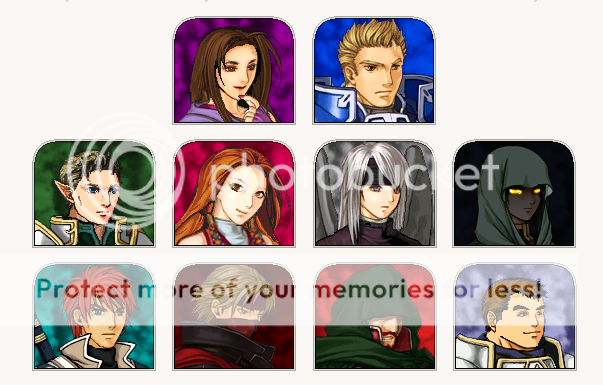
I did kinda take Kathryn's advice by toning down Kalon's but other than that I changed the hooded guys (who's is that?) cause that red seemed too bright.

 Re: Emoria Character Icons
I've changed my mind about how closely the background matches the clothing. It's not so bad, and really it's the faces that matter. There are avatars and full pictures to show off Kalon's details from the Portraits. ^^_^^
Kathryn Lacey- ★ Administrator ★

- Join date : 2009-05-28

Posts : 6968
 Re: Emoria Character Icons
I like the new coloring. Very nice. Each matches well.

Bird of Hermes- Wraith

- Join date : 2009-10-26

Posts : 2279
Age : 34
Location : The Land of Make Believe
 Re: Emoria Character Icons
Those are perrrrrty.
XD
XD

Dax- Ghost

- Join date : 2009-10-19

Posts : 1766
Location : Montreal
 Re: Emoria Character Icons
My favorites are numbers two, four, and six. One is too bulky, five is too tall, and there's really nothing wrong with three. It's just not favored. XD
Kathryn Lacey- ★ Administrator ★

- Join date : 2009-05-28

Posts : 6968
 Re: Emoria Character Icons
I was bored and needed the practice anyway, so I decided to screw around in Photoshop. I personally think Sighlent's are better, because they're less bulky and have a wider array of color. I just figured I'd post these because I didn't want to work put into them to be entirely wasted. Perhaps they can spark ideas or some such...
Gold & Silver Edition:

Platinum & Gold Edition:

Gold & Silver Edition:

Platinum & Gold Edition:


Weiss- Poltergeist

- Join date : 2009-08-02

Posts : 798
Age : 38
Location : Delaware, United States
 Re: Emoria Character Icons
Those are pretty too. The thing I would do with all of the signatures is perhaps make them smaller.

Bird of Hermes- Wraith

- Join date : 2009-10-26

Posts : 2279
Age : 34
Location : The Land of Make Believe
 Re: Emoria Character Icons
My favorite is the Platinum and Gold because the silver aura of the first one fades into FoG's background too much. However, the text is easier to read in the first one... =3
I think they're really good, too, but you're right about them being too big. I really like how well they flow, though.
I think they're really good, too, but you're right about them being too big. I really like how well they flow, though.
Kathryn Lacey- ★ Administrator ★

- Join date : 2009-05-28

Posts : 6968
Page 2 of 7 •  1, 2, 3, 4, 5, 6, 7
 Similar topics
» Topic Icons Now Available
» Emoria: OOC
» Emoria: OOC
» Dax's little....friends?
» Emoria: Information
» Emoria: OOC
» Emoria: OOC
» Dax's little....friends?
» Emoria: Information
Page 2 of 7
Permissions in this forum:
You cannot reply to topics in this forum


 by
by 
