Kalon's Portrait Studio
+32
Silvan Arrow
Chainlinc3
Crazy Hobo
The_End
quakernuts
Fluesopp
Buzzwulf
Attie
Blackrock
Shadow Moonseye
Spectre
Cypher
Marionette
HawktheThird
Dax
IRLGoat
Loki
Guilty Carrion
Kathryn Lacey
ImmortalSin
[Soma]
Bird of Hermes
Gabe
Eternity
Hello Danger
Sighlent
Gadreille
Digital Muse
Weiss
Gunneh
Stion Gyas
Kalon Ordona II
36 posters
FOG: Footsteps of Ghosts :: Out of Character :: Art & Design :: Art Trades, Requests, and Commissions
Page 8 of 24
Page 8 of 24 •  1 ... 5 ... 7, 8, 9 ... 16 ... 24
 Re: Kalon's Portrait Studio
Ryona:Tifa::Loki:Vincent.
Great job kalon!
Great job kalon!

Gadreille- ★ Administrator ★

- Join date : 2009-07-26

Posts : 5277
 Re: Kalon's Portrait Studio
Alrighty, that's probably it for me for tonight. xD I'll be busy tomorrow, but I should be around. ^^
 Re: Kalon's Portrait Studio
I like it... but can you make it a little more... what's the word here.. dynamic? Maybe put it in red or deep green? The notes are more of a minor element, not really like in ImmortalSin. (Sorry, I'm really picky >D, great job though)
Guest- Guest
 Re: Kalon's Portrait Studio
Kalon, just so you know, if you need help with making the 'reverse signatures' I would be happy to help. I'm sure with a bit of instruction I can easily pump out half of them for you.

Gadreille- ★ Administrator ★

- Join date : 2009-07-26

Posts : 5277
 Re: Kalon's Portrait Studio
Aww thanks, Ryona. Tell you what: once I start making 'em, I'll send you whatever elements I use. You have GIMP or photoshop, right? You can use the elements as layers. Or, alternatively, I could email some sort of template to you in a file that keeps layers. 

 Re: Kalon's Portrait Studio
Yes, I have photoshop. I'm sure a quick how to would suffice. I just need to know the layout of the graphic and maybe a bit of instruction if I'm not sure how you did a certain graphic.

Gadreille- ★ Administrator ★

- Join date : 2009-07-26

Posts : 5277
 Re: Kalon's Portrait Studio
I'm kinda confused about the whole reverse signature. :S
Mind elaborating the otherwise uneducated??
Mind elaborating the otherwise uneducated??
 Re: Kalon's Portrait Studio
I can answer that! The reverse siggie is put at the top of your post, and it's function in the RP is that it will allow us to quickly know who the poster is posting with. Because of the large number of Rpers the Rp will undoubtly have, so we're not scrambling to remember who so and so is. It also removes clutter, and looks wicked to boot!

Guilty Carrion- Poltergeist

- Join date : 2010-01-12

Posts : 856
Age : 33
Location : The Underdark
 Re: Kalon's Portrait Studio
Heh heh heh...I'll pretty it down. It makes things neater and easier to understand.

Guilty Carrion- Poltergeist

- Join date : 2010-01-12

Posts : 856
Age : 33
Location : The Underdark
 Re: Kalon's Portrait Studio
Ah well...you could o' just said that. XD
What all will be on these by the by?
What all will be on these by the by?
 Re: Kalon's Portrait Studio
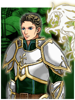
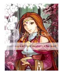
bust icons of our character portraits, accompanied by fancy something-or-other and our character names and titles.
Also, here's your updated sig, Elric.

Also, here's your updated sig, Elric.

 Re: Kalon's Portrait Studio
Oooh, would you like to help? 
I can send you the same thing as Ryona, as soon as I make it.
Or ACTUALLY... if you guys want, we could each make a different one and either use one or combine them. ^^ I was thinking of a thick and elaborate gold vine going across, with back-lit black letters in front of it saying the character name and title. The bust icon would be on the left, in some sort of gold frame. The gold vine(s) could sprout from the frame. That's my current concept.
Here....
|8|~~~~~~~~~~~~~~~~~~~~~~
...like that, only a lot bigger, and WAAAAY cooler. xD
 Re: Kalon's Portrait Studio
OK Kalon, I might have to have you do one for the Twins in Sephiris and perhaps one that looks more like the real me, now. That'd be way fun!

Digital Muse- Guardian Ghost

- Join date : 2009-08-12

Posts : 1381
Location : South Dakota
 Re: Kalon's Portrait Studio
Kalon Ordona II wrote:Oooh, would you like to help?
I can send you the same thing as Ryona, as soon as I make it.
Or ACTUALLY... if you guys want, we could each make a different one and either use one or combine them. ^^ I was thinking of a thick and elaborate gold vine going across, with back-lit black letters in front of it saying the character name and title. The bust icon would be on the left, in some sort of gold frame. The gold vine(s) could sprout from the frame. That's my current concept.
Here....
|8|~~~~~~~~~~~~~~~~~~~~~~
...like that, only a lot bigger, and WAAAAY cooler. xD
If you make the "vine", and an empty slot where the avatars go, I can easily change the colors of the "vine", insert the avatars, and insert the names of the characters. What do you think?

Gadreille- ★ Administrator ★

- Join date : 2009-07-26

Posts : 5277
 Re: Kalon's Portrait Studio
Kalon I just meant to make the background like a deep green or blue, sorry for being picky xD
Guest- Guest
 Re: Kalon's Portrait Studio
Ehh, we might as well have all of them be gold. *shrug*
The real difficulty is going to be making the vine-y-thingy in the first place.
Maybe something like.....


Actually the green one is a lot like what I was thinking.
The real difficulty is going to be making the vine-y-thingy in the first place.
Maybe something like.....


Actually the green one is a lot like what I was thinking.
 Re: Kalon's Portrait Studio
I like the shape of the green ones. I am sure you can change the color if needed for each person's name.

Bird of Hermes- Wraith

- Join date : 2009-10-26

Posts : 2279
Age : 34
Location : The Land of Make Believe
 Re: Kalon's Portrait Studio
Yea, I was thinking each person could have a unique color of vine. But just green is fine too.

Gadreille- ★ Administrator ★

- Join date : 2009-07-26

Posts : 5277
 Re: Kalon's Portrait Studio
I love the avatar, you did an excellent job!
The signature is a whole new level in of itself, great choice in font, detail, and background. You certainly do not disappoint. There is only one portion that I would like to alter. The idea to have him hanging upside-down was good, it's just that the hair and the scarf's disregard for gravity that throws off the image.
Instead, could you orient him normally though still facing the same direction? You may want to flip the gradient with that also, I love the way you incorporated him with the black. Also, for a slight change to the image, could you use the closed-eyes version and enlarge it so that there is more focus on his head. I was thinking maintaining the same area devoted to the character, at least in height, but enlarging it where the lowest portion is around mid-shoulder. That is if the image quality doesn't degrade significantly when scaled up like that.
After that I think it is safe to say that the set would be exactly what I was looking for. Thank you so much!


Loki- Guardian Ghost

- Join date : 2009-06-03

Posts : 2275
Age : 39
Location : Ohio
 Re: Kalon's Portrait Studio
How about now? 

If this one still doesn't work, I must require you to supply me with a specific, detailed description of your mental image.

If this one still doesn't work, I must require you to supply me with a specific, detailed description of your mental image.

 Re: Kalon's Portrait Studio
Loki wrote:I love the avatar, you did an excellent job!
The signature is a whole new level in of itself, great choice in font, detail, and background. You certainly do not disappoint. There is only one portion that I would like to alter. The idea to have him hanging upside-down was good, it's just that the hair and the scarf's disregard for gravity that throws off the image.
Instead, could you orient him normally though still facing the same direction? You may want to flip the gradient with that also, I love the way you incorporated him with the black. Also, for a slight change to the image, could you use the closed-eyes version and enlarge it so that there is more focus on his head. I was thinking maintaining the same area devoted to the character, at least in height, but enlarging it where the lowest portion is around mid-shoulder. That is if the image quality doesn't degrade significantly when scaled up like that.
After that I think it is safe to say that the set would be exactly what I was looking for. Thank you so much!
Going from black to transparent was a way to show off the dripping blood.
I thought about changing things because of the gravity, but the scarf would then disappear off the edge of the image, since the tallest it can be is 200 pixels. (I believe 700x200 is the limit for signatures.)
Enlarging the head might work, since we won't see the scarf that way. As for flipping the gradient, that might be too difficult, since I didn't save the layers. Also, the idea for the black at the top was for a background for the words. If the black and the words are on the bottom, you don't get to see the blood as much. In addition, having the blood at the bottom matches the order of the quotes, with "Sanguine," (blood color) in front of the blood.
Should I just do the enlarged head and shoulders, then? With the eyes closed?

 Re: Kalon's Portrait Studio
Ah yes, I see what you mean. I like the way the rest of the signature flows together much more than that little detail regarding gravity. Plus, we all know assassins don't obey the laws of physics like the rest of us mortals; I would like to see the physicist who dares claim otherwise.
Let's try the enlargement thing with the eye modification and see how that turns out.

Let's try the enlargement thing with the eye modification and see how that turns out.

Loki- Guardian Ghost

- Join date : 2009-06-03

Posts : 2275
Age : 39
Location : Ohio
 Re: Kalon's Portrait Studio
Current list:
--Kathryn (in progress)
--Loki signature (in progress)
--Dax
--Kail DeWraith
--Plaguewalker set
--Deadeye update
--more Digital Muse characters (undecided)
--Kathryn (in progress)
--Loki signature (in progress)
--Dax
--Kail DeWraith
--Plaguewalker set
--Deadeye update
--more Digital Muse characters (undecided)
 Re: Kalon's Portrait Studio
Ryona Noel wrote:Yea, I was thinking each person could have a unique color of vine. But just green is fine too.
Well since we've already begun associating everyone in the RP with a specific color I think it would work out better if we did do it like this.
 Re: Kalon's Portrait Studio
I wasn't thinking green; I was thinking gold. 
Still, you've got a point. Since we've got colors ANYWAY... we might as well use them. xD
Let's still do the gold vine, but have like a ribbon or shield or flag for colors.

Still, you've got a point. Since we've got colors ANYWAY... we might as well use them. xD
Let's still do the gold vine, but have like a ribbon or shield or flag for colors.
 Re: Kalon's Portrait Studio
After thinking about it, I was wondering if you could make me a signature more closely resembling the ones that Solvone, Ryona, and you have. I like the coat of arms/official organization sigil feeling behind them. Though, I feel the sigil would work best in my case.
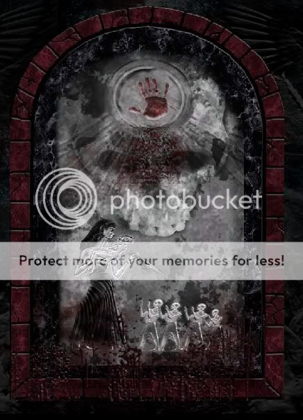
I would like to keep the font and the quote the same, though you can manipulate it to fit on a smaller image that is more closely sized to your own. If it is at all possible to do so while keeping it in context and maintaining some sort of border, try to keep the background the same as the one you made before. As for the sigil portion of the signature, I would like it to include elements from this picture:

Specifically the circle containing the hand print. If you are running short of inspiration, here is the link to the site that I got the image from. If you've ever played Elder Scrolls: Oblivion, I am wanting to go with a Dark Brotherhood theme (assassin's guild).
I hope I'm not inconveniencing you terribly by asking this of you. Since this more than a simple tweak and resize, you can put me at the bottom of your to do list so as not to be unfair to others if you think it'll take a significant amount of time.
I would like to keep the font and the quote the same, though you can manipulate it to fit on a smaller image that is more closely sized to your own. If it is at all possible to do so while keeping it in context and maintaining some sort of border, try to keep the background the same as the one you made before. As for the sigil portion of the signature, I would like it to include elements from this picture:

Specifically the circle containing the hand print. If you are running short of inspiration, here is the link to the site that I got the image from. If you've ever played Elder Scrolls: Oblivion, I am wanting to go with a Dark Brotherhood theme (assassin's guild).
I hope I'm not inconveniencing you terribly by asking this of you. Since this more than a simple tweak and resize, you can put me at the bottom of your to do list so as not to be unfair to others if you think it'll take a significant amount of time.

Loki- Guardian Ghost

- Join date : 2009-06-03

Posts : 2275
Age : 39
Location : Ohio
Page 8 of 24 •  1 ... 5 ... 7, 8, 9 ... 16 ... 24
FOG: Footsteps of Ghosts :: Out of Character :: Art & Design :: Art Trades, Requests, and Commissions
Page 8 of 24
Permissions in this forum:
You cannot reply to topics in this forum


 by
by 


